Have you ever created a stunning design, edited a beautiful photograph, or color-graded a video, only to find it looks completely different on another screen? The frustration is real, and it stems from one common issue: an uncalibrated monitor. In 2026, where visual content dominates, ensuring your display shows accurate colors is not just a luxury; it's a necessity for professionals and enthusiasts alike. This comprehensive guide will walk you through how to calibrate your monitor for accurate color, helping you achieve consistent and true-to-life visuals across all your projects. Understanding and implementing proper monitor calibration can save you countless hours of rework and prevent the headache of inconsistent color representation, making your digital work shine as intended.
Key Takeaways
- Color Accuracy is Crucial: Uncalibrated monitors lead to inconsistent visuals across devices, impacting professional work in design, photography, and video.
- Built-in Tools Offer Basic Calibration: Windows and macOS include native display calibration utilities (e.g., Display Color Calibration, Display Calibrator Assistant) that can improve gamma, brightness, and contrast.
- Gamma and Brightness Matter: Proper adjustment of gamma ensures correct mid-tone luminance, while brightness impacts overall visibility and reduces eye strain.
- Hardware Calibrators are Superior: For critical color work, a dedicated hardware colorimeter and profiling software provide far more accurate and consistent results than software-only methods.
- Regular Calibration is Key: Monitors drift over time; calibrating your display every few weeks or months ensures ongoing color accuracy and consistency.
Using Windows/Mac Built-in Calibration Tools to Calibrate Your Monitor for Accurate Color
For many users, especially those not performing highly color-critical work, the built-in operating system tools offer a solid starting point for improving color accuracy. These tools are designed to guide you through a series of visual adjustments that can significantly enhance your monitor's display. Learning how to calibrate your monitor for accurate color using these native solutions is a foundational skill.
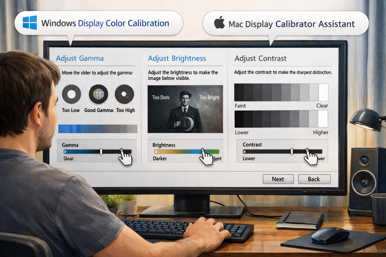
Windows Display Color Calibration
Windows users have access to a straightforward utility known as "Display Color Calibration." This tool guides you through adjusting several key display settings.
-
Accessing the Tool:
- Type "Calibrate display color" into the Windows search bar (bottom left of your screen).
- Select "Calibrate display color" from the search results. This will launch the Display Color Calibration wizard.
-
Basic Setup:
- The wizard will first guide you through setting basic display properties, such as ensuring your monitor is set to its native resolution.
- It will also advise you to reset your monitor's color settings to factory defaults via its on-screen display (OSD) menu. This provides a clean slate for calibration.
-
Adjusting Gamma:
- Gamma controls the brightness of mid-tones without affecting the darkest or lightest parts of the image. The goal is to make a small dot in the center of a pattern disappear or blend in with the background.
- Use the slider to adjust until the visible dots and lines in the example image are minimized or disappear. Take your time with this step, as it significantly impacts how images appear.
-
Adjusting Brightness and Contrast:
- Brightness: This controls the overall lightness or darkness of the image. The wizard will show an image with a dark suit and an 'X' on it. Adjust your monitor's physical brightness controls (usually buttons on your monitor or its stand) until you can clearly see the suit's details without the 'X' being too prominent or disappearing into the background.
- Contrast: This controls the difference between the brightest and darkest parts of the image. The wizard displays an image with varying shades of white. Adjust your monitor's physical contrast controls until you can see all the folds and wrinkles in the shirt without losing detail in the brightest areas. The goal is to maximize detail in bright regions without clipping.
-
Adjusting Color Balance:
- This step allows you to manually adjust the Red, Green, and Blue color levels. The wizard will show grey bars. Your aim is to make these bars appear as neutral grey as possible, without any noticeable color tint (reddish, greenish, or bluish).
- Use the sliders for Red, Green, and Blue to fine-tune the balance. This can be tricky without a reference, so trust your eyes to achieve a neutral grey.
-
Finishing the Calibration:
- Once you complete all steps, the wizard offers a side-by-side comparison of your "Current calibration" and "Previous calibration" (or "Factory settings"). You can toggle between them to see the difference.
- Saving the new calibration creates an ICC profile that Windows will then use.
Mac Display Calibrator Assistant
macOS also provides a built-in solution called the "Display Calibrator Assistant." It's integrated into the system preferences and offers a user-friendly experience for Mac users looking to improve their screen's color accuracy.
-
Accessing the Tool:
- Go to
System Settings(orSystem Preferenceson older macOS versions). - Click on
Displays. - Look for the
Colortab or section, then clickCalibrate...This will launch the Display Calibrator Assistant.
- Go to
-
Introduction and Expert Mode:
- The assistant will provide an introduction. It's often beneficial to check the "Expert Mode" box, as this provides more granular control over gamma and white point settings.
-
Adjusting Gamma:
- Similar to Windows, you'll be presented with a pattern to adjust gamma. The goal is to make the grey shape in the middle blend seamlessly with the background.
- Adjust the slider until the pattern appears uniform without a noticeable target shape.
-
Target White Point:
- This is a crucial step for Mac users. White point refers to the color temperature of white. For most general use and sRGB content, a white point of D65 (6500K) is recommended. For professional print work, a warmer D50 (5000K) might be preferred, but D65 is the industry standard for web and video.
- You can select a default option or manually adjust using the expert mode.
-
Admin Name and Save:
- You'll be asked to provide a name for your newly created color profile. Choose something descriptive, like "My Monitor Calibration – 2026."
- Save the profile, and your Mac will immediately begin using it.
While these built-in tools are helpful, they rely on your subjective visual perception. This means results can vary depending on your eyesight, ambient lighting, and even the fatigue of your eyes. For higher precision, dedicated hardware is often recommended.
Adjusting Gamma and Brightness for Eye Health and Accuracy
Beyond achieving accurate colors for your creative projects, proper monitor calibration, especially concerning gamma and brightness, plays a significant role in your eye health and overall comfort during extended use. Neglecting these settings can lead to eye strain, fatigue, and even headaches. When you learn how to calibrate your monitor for accurate color, you're also learning to protect your vision.
Understanding Gamma
Gamma is a critical setting that determines the luminance (brightness) of the mid-tones in an image. It affects how dark or light the non-black and non-white areas appear.
- Impact on Visuals: A gamma that's too high can make images look overly dark and contrasty, crushing details in shadows. Conversely, a gamma that's too low will make images appear washed out and flat, losing depth.
- Standard Gamma Values:
- For most PC monitors and the sRGB color space (standard for web content), a gamma of 2.2 is the industry standard. This value provides a good balance for viewing in typical room lighting.
- Older Mac systems sometimes used a gamma of 1.8, but modern macOS versions have shifted to 2.2 for consistency with Windows and web standards.
- Why it Matters for Accuracy: Incorrect gamma means that even if your darkest blacks and brightest whites are accurate, all the shades in between will be off. This can significantly alter the perceived mood and detail of an image or video. For someone engaged in demanding tasks like reviewing architectural plans or detailed scientific images, accurate gamma is paramount. You can find out more about the importance of precision in various fields, including technical roles, by checking out resources like 63,000 Electrician Jobs with Visa Sponsorship in Norway.
Optimizing Brightness
Brightness, or luminance, controls the overall light output of your monitor. It's a setting that needs to be balanced carefully for both accuracy and comfort.
- Too Bright: An overly bright monitor can cause significant eye strain, especially in a dimly lit room. It can also make colors appear blown out and less saturated.
- Too Dim: A monitor that's too dim can make details hard to discern, especially in dark areas, and force your eyes to strain to see.
- Recommended Luminance Levels:
- For general office work or web browsing in a well-lit room, 120-160 cd/m² (candelas per square meter) is often comfortable.
- For critical photo editing, graphic design, or video work, a lower luminance of 80-120 cd/m² is typically recommended, especially if your workspace has controlled lighting. This range helps reduce eye fatigue during long sessions and provides a better reference for print outputs.
- Consider your ambient light. A bright room requires a brighter monitor to maintain perceived contrast, while a dim room demands a dimmer monitor.
- Adjusting Brightness: Always use your monitor's physical controls (OSD menu) to adjust brightness, not software settings on your computer. Software adjustments often manipulate the image data rather than the backlight, which can degrade image quality.
Impact on Eye Health and Workflow
Properly adjusted gamma and brightness settings contribute significantly to a healthier and more productive workflow:
- Reduced Eye Strain: Optimal brightness levels matching your ambient lighting prevent your eyes from overworking.
- Consistent Perception: When your monitor's brightness is consistent, your eyes don't have to constantly adapt, leading to less fatigue.
- Accurate Decision-Making: For designers and photographers, accurate gamma and brightness mean that the colors and tones they see on screen are closer to what others will see, and what will be produced in print. This eliminates guesswork and reduces revision cycles. Imagine you're working on an important project, perhaps preparing a portfolio for 25,000 Undergraduate Scholarships in Australia; inaccurate colors could misrepresent your work.
Balancing these settings is fundamental. While subjective adjustments using built-in tools can help, for truly precise control over gamma and brightness for color-critical tasks, hardware calibration is the gold standard.
When to Buy a Hardware Calibrator (and When Not To)
Deciding whether to invest in a dedicated hardware calibrator is a common dilemma. While built-in software tools offer a convenient starting point, they have limitations. Understanding these differences is key to truly learning how to calibrate your monitor for accurate color in a professional context.
What is a Hardware Calibrator?
A hardware calibrator, often called a colorimeter or spectrophotometer, is a device that attaches to your monitor screen. It works with specialized software to:
- Measure Colors: It measures the actual colors and light output of your monitor.
- Compare to Standards: It compares these measurements against known color standards (like sRGB, Adobe RGB, DCI-P3).
- Create a Profile: It generates a precise ICC (International Color Consortium) profile that corrects your monitor's display to match the target standards. This profile is loaded by your operating system to ensure accurate color rendition.
When You Should Buy a Hardware Calibrator
For certain professions and activities, a hardware calibrator is an indispensable tool. If your work involves any of the following, consider it a necessary investment:
- Professional Photography & Retouching: Photographers rely on seeing accurate colors and tones to make critical editing decisions. A calibrated monitor ensures that skin tones, landscapes, and product shots appear as intended, both on screen and in print. Without it, hours spent editing could be wasted if the colors are off.
- Graphic Design & Web Design: Designers need to ensure branding colors are consistent and that their creations look the same for clients and across different user devices. This is especially true for visual elements, like logos or marketing materials for opportunities such as 60,000 STEM Scholarships in the USA 2026.
- Video Editing & Color Grading: Filmmakers and video editors meticulously adjust colors to evoke mood and maintain visual consistency. An uncalibrated monitor can lead to frustrating color shifts and rework when footage is viewed on broadcast monitors or other calibrated screens.
- Pre-press & Print Production: If you're preparing files for commercial printing, color accuracy is paramount. What you see on your screen needs to closely match what comes out of the printer. Hardware calibrators help bridge this "print-to-screen" gap.
- Professional Gaming/Esports (Competitive): While less critical than creative work, competitive gamers often benefit from precise color and contrast for better visibility in fast-paced environments, though it's less about "accuracy" and more about optimizing for competitive advantage.
- Anyone Requiring Consistency: If you frequently switch between multiple monitors or work in a team where consistent color is vital, a hardware calibrator ensures all displays are presenting the same visual information.
💡 "For professionals, a hardware calibrator isn't an accessory; it's the foundation of a reliable visual workflow."
When You Might Not Need a Hardware Calibrator
For many users, the benefits of a hardware calibrator might not outweigh the cost, and built-in software options or even factory-tuned monitors are sufficient.
- Casual Browsing & Office Work: If your primary use for a monitor is web browsing, email, word processing, or general office applications, extreme color accuracy is typically not required. Slight color shifts won't impact your productivity or enjoyment significantly.
- Casual Gaming: Unless you're a professional esports player, minor color inaccuracies in games are usually not disruptive. Most games are designed to look good on a wide range of consumer displays.
- Streaming Content (Netflix, YouTube): While a good picture is always enjoyable, most streaming platforms optimize content for a broad audience. Your enjoyment won't typically be hampered by the lack of a perfectly calibrated display.
- Budget Constraints: Hardware calibrators typically range from $150 to $500+, with professional-grade spectrophotometers costing significantly more. If this investment is beyond your budget and your work isn't color-critical, it might be an unnecessary expense.
- Factory-Calibrated Displays: Some high-end monitors, especially those marketed to professionals, come factory-calibrated with a report. While even these can drift over time and benefit from periodic recalibration, their out-of-the-box accuracy is often superior to consumer-grade monitors. However, even these can benefit from a custom profile tailored to your specific environment and workflow.
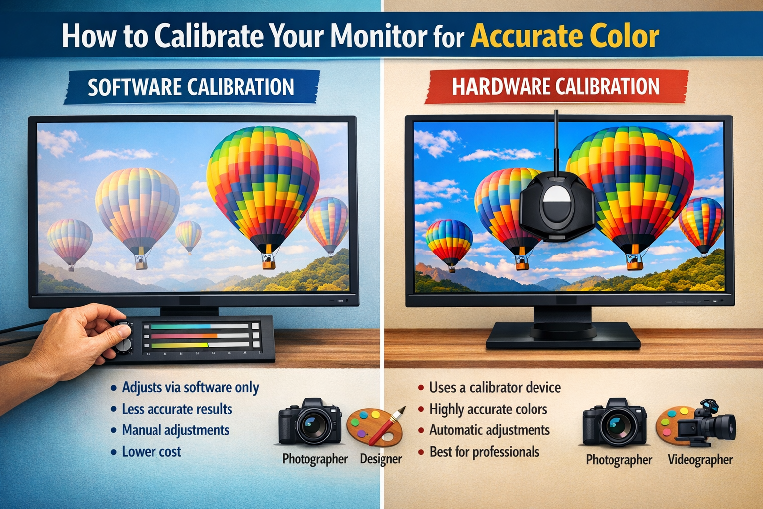
| Feature | Software Calibration (Built-in) | Hardware Calibration (Colorimeter) |
|---|---|---|
| Method | Visual judgment, manual adjustments | Sensor measurement, automatic profile generation |
| Accuracy | Subjective, dependent on human eye & ambient light | Objective, precise, standardized |
| Cost | Free (included with OS) | $150 – $500+ |
| Setup Time | Quick (10-20 minutes) | Moderate (20-45 minutes for initial setup) |
| Consistency | Varies, susceptible to changes in environment or user fatigue | Highly consistent, repeatable results |
| Ideal For | General users, slight improvements, non-critical tasks | Professionals (designers, photographers, videographers), critical tasks |
| Output | Basic ICC profile | Highly accurate, detailed ICC profile with custom targets |
In summary, if your livelihood or creative reputation depends on precise color representation, a hardware calibrator is a non-negotiable tool to learn how to calibrate your monitor for accurate color. For casual users, the built-in operating system tools offer a noticeable improvement without the financial outlay.
Conclusion: Essential for Anyone Doing Design or Video Work
In the dynamic world of digital content creation, where images and videos are consumed across a myriad of devices in 2026, the importance of monitor calibration cannot be overstated. Understanding how to calibrate your monitor for accurate color is no longer just for niche professionals; it's a fundamental skill for anyone serious about their visual work. From the subtle nuances of a photographer's portrait to the precise color grading in a video production, inconsistent colors can undermine your efforts and lead to frustrating rework.
For casual users, the built-in calibration tools in Windows and macOS provide a significant step up from an uncalibrated display, offering improved visual comfort and a better starting point for color accuracy. These tools are fantastic for general web browsing, office tasks, and casual content consumption. They empower you to make subjective adjustments to gamma, brightness, and color balance that can dramatically enhance your viewing experience and even contribute to better eye health during long hours in front of the screen.
However, for professionals in fields such as graphic design, photography, video editing, and print production, the reliance on subjective visual judgment is simply not enough. These demanding professions require the objective precision that only a dedicated hardware calibrator can provide. Investing in a colorimeter ensures that your display adheres to industry standards, guaranteeing that the colors you see on your screen are as close as possible to what others will see, or what will appear in print. This level of accuracy builds trust with clients, streamlines workflows, and ultimately produces higher-quality output. Whether you're applying for a 70,000 Urgent Construction Jobs in Australia with Free Visa Sponsorship and need to present a visually striking portfolio, or developing creative assets for global distribution, color fidelity is paramount.
Actionable Next Steps:
- Assess Your Needs: Determine if your work requires basic visual improvement or professional-grade color accuracy.
- Start Simple: If new to calibration, begin with your operating system's built-in tools (Windows Display Color Calibration or Mac Display Calibrator Assistant) to understand the basics of gamma, brightness, and contrast.
- Consider Hardware: If your work is color-critical, research and invest in a quality hardware calibrator. Brands like X-Rite (now Calibrite) and Datacolor are reputable choices.
- Calibrate Regularly: Monitors drift over time. Aim to recalibrate your display every few weeks to every few months, depending on usage and criticality, to maintain optimal color accuracy.
- Control Your Environment: Work in consistent lighting conditions to minimize external influences on color perception. Avoid direct sunlight or overly bright ambient light on your screen.
- Verify Your Work: After calibration, always view your work on multiple devices (phones, tablets, other monitors if available) to get a broader sense of how your colors translate.
Embracing monitor calibration is a crucial step towards elevating your digital creations, ensuring your vision is accurately represented, and safeguarding your professional reputation in the visually driven landscape of 2026 and beyond.
SEO Meta Title: Calibrate Your Monitor: Accurate Color for 2026 Pros
SEO Meta Description: Learn how to calibrate your monitor for accurate color in 2026. Master gamma, brightness, and choose hardware tools for professional design & video work.